9 best macOS apps for data visualization
Last Updated on May 21, 2024 by Jhonni Jets
Data visualization is the graphical representation of data through tools like charts, graphs, heat maps, and more. It allows for trends, outliers, and patterns to emerge from large datasets in an easy to understand visual format. For data scientists, analysts, and researchers, powerful data visualization software is essential.
The Mac platform offers a wide variety of excellent data visualization apps. In this article, we will highlight the 10 best options for creating engaging and insightful visualizations on macOS. We’ve focused on ease of use, customization options, supported data types, publishing capabilities, and pricing to identify the top choices across different budgets and experience levels.
Table of Content
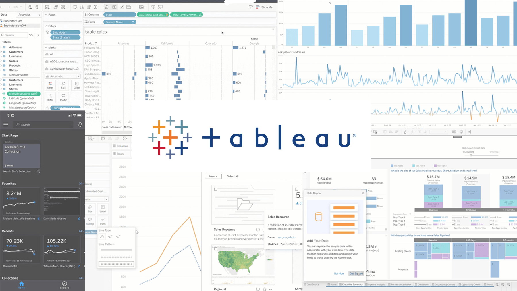
Tableau

Tableau is one of the most full-featured and popular data visualization tools available. With an intuitive drag-and-drop interface, Tableau makes it simple to connect to different data sources, transform data, and build interactive dashboards, stories, and reports. It supports connecting to hundreds of data sources including databases, spreadsheets, cloud services and more. Tableau offers an extensive library of chart types including histograms, tree maps, flows maps, gauges and more.
Tableau offers tight integration with Microsoft Excel, allowing you to easily connect to and visualize data stored in Excel files. Dashboards can be published to Tableau Server for sharing or Tableau Public as interactive web pages. Tableau offers both desktop and web-based options, along with mobile apps, making insights accessible anywhere. Pricing starts at $999 per user per year for the desktop version.
While the learning curve is steeper than some options, Tableau is extremely powerful and configurable. It remains the gold standard for enterprise-level visualization and analytics projects where advanced customization and sharing capabilities are required.
Microsoft Power BI
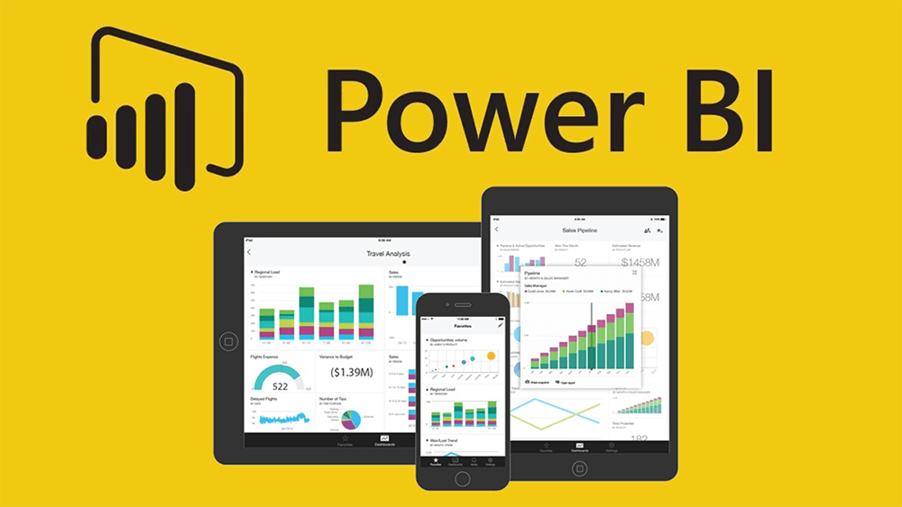
Power BI is Microsoft’s cloud-based business analytics service for visualizing and sharing insights. Similar to Tableau, it offers an intuitive interface and supports connecting to hundreds of data sources. Power BI has a comprehensive library of visualizations including maps, flows, gauges and more interactive charts. Dashboards can include narrative text, images, and videos to tell engaging data stories.
Power BI integrates tightly with Microsoft products like Excel, enabling you to create visualizations from Excel data with just a few clicks. Insights can be published to the Power BI service for sharing or embedding reports on websites. The Power BI mobile apps allow users to access and interact with reports on any device. Pricing starts at $10 per user per month for the Pro version including advanced analytics and collaboration.
While not as fully-featured as Tableau, Power BI is still very capable and a top choice for organizations already investing in Microsoft’s business analytics stack. The seamless Excel integration and cloud-based approach also gives it a lower barrier to entry than Tableau for some users.
Qlik Sense

Qlik Sense is another strong enterprise option for intuitive visual analytics. It offers a Associative Data Model that allows users to freely explore relationships across all your data in an engaging self-service manner. Visualizations can be connected using links to enable interactive filtering and selections across charts.
Qlik Sense features an extensive library of visualization types and the ability to build custom visual components as well. Built-in geo mapping capabilities visualize geographic data on maps and globes. Dashboards support interactive storytelling and can be published to Qlik Sense Enterprise for collaboration and sharing. Self-hosted options are available or it can run in the cloud on Qlik Sense SaaS.
While the licensing may be more expensive than some competitors, Qlik Sense is extremely powerful and scales well for enterprise deployments. The associative approach enables unique insights through interactive exploration across all your available data. It remains one of the top choices for complex, self-service business analytics.
Zoho Analytics
Zoho Analytics is a strong low-cost option for entry-level and small business data visualization needs. It supports connecting to spreadsheets, databases, and other cloud services. Standard chart types include bar, line, scatter, and pie charts along with maps, filters and more.
Dashboards allow you to analyze multiple metrics across different dimensions like time, category and location. They can be shared within an organization via the Zoho platform or published publicly as static image files. Zoho offers tight 365-like integration across its suite of business products as well.
While less fully-featured than Tableau or Power BI, Zoho Analytics is still capable and offers a low monthly price starting at just $25 per user per month. This makes it a cost-effective choice for basic analytics, dashboarding and reporting needs without a large investment.
Google Data Studio

Google Data Studio is Google’s free, browser-based data visualization and reporting tool. It supports connecting to over 60 different data sources including Google Analytics, Google Sheets, and other common databases and SaaS apps. Visualization types include tables, charts, geo maps and more.
Reports can include multiple dashboards and pages to tell stories across different aspects of your data. Template layouts are available or you can build custom designs from scratch. Published reports can be easily embedded on websites or shared internally. Google’s authentication ensures reports are securely shared within teams or organizations.
While limited compared to paid tools, Data Studio remains an excellent free option for basic data storytelling and dashboarding needs, especially for projects requiring Google suite integrations or web sharing. The lack of advanced customization may be a limitation for some, but it remains very capable for many entry-level use cases.
Domo

Domo is a comprehensive business intelligence and analytics platform. It features an intuitive interface optimized for non-technical users. Domo supports connecting to over 50 different enterprise systems and cloud services. Visualizations include standard and advanced custom types.
Apps can include dashboards, data stories, and alerts. Automated workflows enable setting triggers to notify teams of actionable insights. Integration with Google Slides also allows embedding visuals in presentations. Insights can be published and seamlessly accessed from any device via mobile apps.
Domo offers powerful templated and custom app building along with collaboration features for teams. While designed for intuitive usability, enough configurability remains to satisfy advanced needs as well. An excellent choice for mid-sized companies requiring integrated BI and analytics capabilities on a single platform.
Charticulator

Charticulator is a user-friendly, entry-level macOS app designed specifically for data visualization creation on the desktop. Connect directly to CSV, TSV or XLSX files to build charts without moving data to the cloud.
Build and customize line, bar, pie, scatter, and other basic chart types through an easy-to-use interface. Export visuals as high-quality image files, or directly to the clipboard for pasting into documents, decks, or reports. Simple yet capable chart building without the investment or learning curve of full BI platforms.
Charticulator offers a affordable and straightforward solution for ad-hoc analytics projects with local files on macOS that don’t require advanced functionality or sharing. While basic, it can handle many one-off visualization needs without increased complexity.
Raw

Raw is a powerful yet approachable macOS data visualization application. Unlike some drag-and-drop oriented tools, Raw aims to be fully customizable through code while still maintaining a friendly interface. Raw supports SQL and CSV data as well as common sources via plugins.
Build custom visualizations in Raw’s code editor by composing marks like points, lines, and areas or utilizing a rich library of chart types. Visuals can be parameterized, allowing dynamic filtering and selection. Publish via image export or to Raw’s embedded web browser.
While requiring some coding knowledge, Raw empowers highly customized visualizations in a desktop app. It fills the gap between basic chart builders and fully-fledged BI platforms, providing power and flexibility for technical users or small teams.
R

R is an open-source programming language and software environment for statistical analysis, visualization, and machine learning. Often considered the gold standard for statistical computing, R has an active global community contributing plugins and code.
Visualization packages like ggplot2, lattice, and core graphics APIs allow generating publication-quality charts on macOS. RStudio is a popular free IDE that tightly integrates R visualization directly on the desktop. Data can be loaded from files or connected databases for analysis.
While requiring coding, R offers unparalleled flexibility and power for statistics and visualization. It remains the top choice for advanced analytics projects that require full customizability and scalability. Combined with RStudio, it offers an excellent environment for statistics and visualization on macOS.
Conclusion
Choosing the best data visualization tool depends greatly on your specific needs, team size, budget, and technical skills. While some paid platforms like Tableau offer immense scalability and customization for enterprise deployments, free or low-cost options like Google Data Studio or Zoho Analytics can address many basic requirements as well.
For technical users or smaller teams, mid-tier apps like Raw, Charticulator and R offer balance between simplicity and power. Overall, the Mac continues to offer some of the top choices across categories, empowering data-driven insights and decision making from the desktop and beyond.